Artifacts
An archive of interactions, taken out of my projects and rebuilt to stand alone.

Context
My best interactions were buried in other projects.
A lot of my interaction work lives inside larger projects: a full-screen menu in Toby & Tye, album-art motion and a colour system in Spotify Now Playing, scroll and card motion in the Ace Trail redesign. There it depended on each project’s fonts, global styles, data and scroll setup, so none of it could be shown, studied or reused on its own.
Artifacts gives each interaction its own module and its own page, alongside motion studies that began as prototypes or small technical questions. It started with six in September 2026 and holds ten now.
| Number | Artifact | Type | From |
|---|---|---|---|
| 001 | Block Orbit | Spatial motion | Personal identity study |
| 002 | Split Menu | Navigation | Toby & Tye |
| 003 | Three Image Orbit | Spatial motion | Personal identity study |
| 004 | Scroll Cinema | Scroll | Personal motion study |
| 005 | Ambient Artwork | Pointer motion | Spotify Now Playing |
| 006 | Palette Shift | Colour system | Spotify Now Playing |
| 007 | Track Transition | State motion | Spotify Now Playing |
| 008 | Spatial Services | Timed tabs | Spatial systems study |
| 009 | Scroll Sequence | Scroll state | Ace Trail |
| 010 | Card Flip | Card motion | Ace Trail |
The archive
An index you scroll sideways.
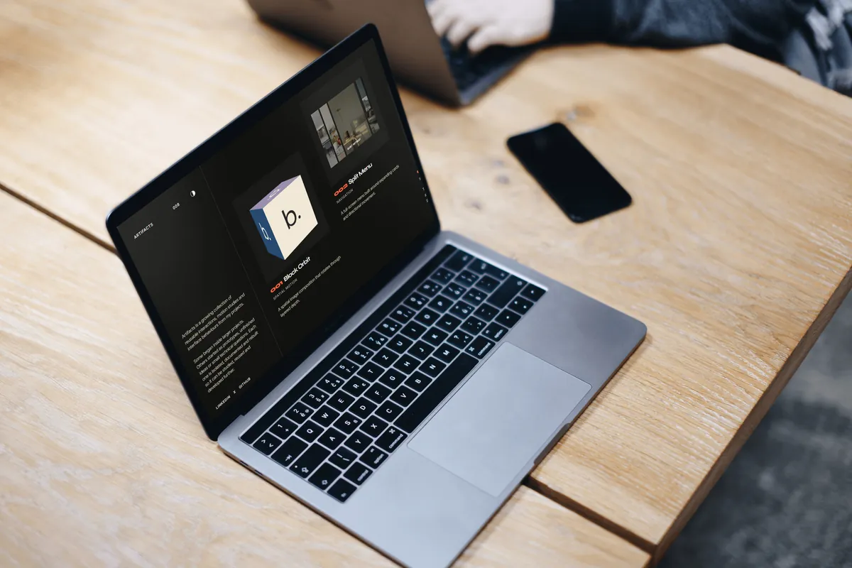
The index is split in two. A fixed column on the left says what the archive is and holds the theme switch; the collection runs to its right like a contact sheet. A vertical mouse wheel moves it sideways, but only while there’s room to move, so it never swallows a scroll it can’t use. Trackpads keep their own sideways swipe, and the collection takes keyboard focus, so the arrow keys scroll it too.
Each card runs a live version of its artifact rather than a thumbnail, because a still shows what an interaction looks like but not how it moves. Open one and come back, and the index returns to the card you left from.
Theme
Light or dark, settled before the first paint.
The archive follows the system setting until you pick one. The choice is saved, and a short script in the document head applies it before anything renders, so a dark visit never flashes light first.
The colours are a small set of tokens with a value for each theme: a warm off-white or near-black ground, two greys for secondary text, and one orange-red accent, used mostly for the artifact numbers.

Rules
Ten artifacts, one set of rules.
Every artifact is built to the same rules, so each new one fits without changing the ones before it. The registry is one typed file, and every artifact page is generated from it at build time.
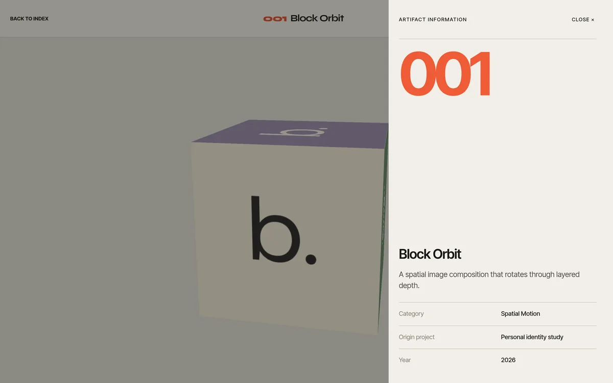
Each page shares one frame: the way back to the index, the number and title, the type, and an Information panel with the description, the project it came from and the year. The panel is a modal dialog: focus moves into it and stays there, Escape or a click outside closes it, and focus goes back to the button.
- Self-contained
- It owns its markup, styles and logic. Styles are SCSS Modules, so nothing leaks into the archive or into another artifact.
- Leaves nothing behind
- Listeners, animation frames, observers, timers and GSAP contexts are all released when it leaves the page.
- Two sizes
- A preview that runs on its own inside a card, and a full version with controls on its own page.
- Reduced motion
- Each one decides what that means: the scroll scene stops pinning, and the menu and track changes happen at once.
- Touch as well as pointer
- Nothing depends on hover alone, and primary controls keep a 44-pixel touch target.
Block Orbit
The first artifact is my own mark.
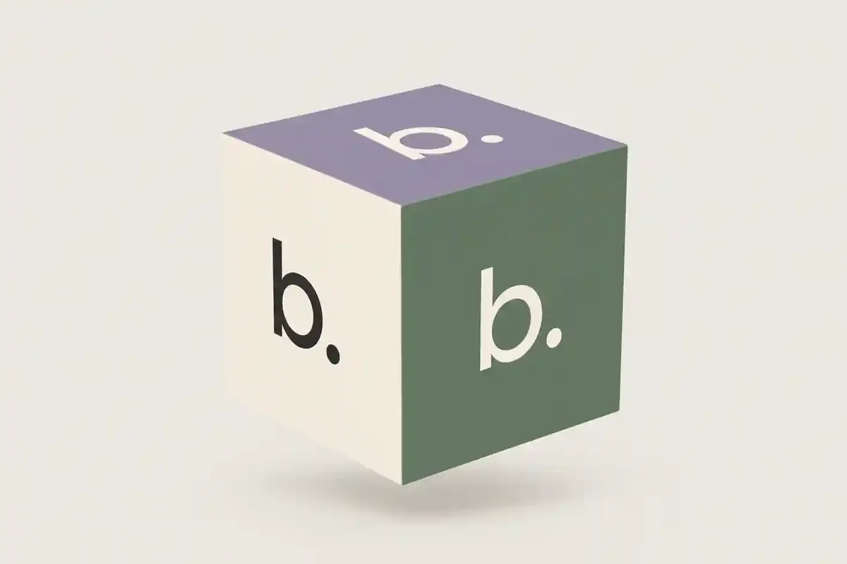
Block Orbit began as an identity study: the b. wordmark on the six faces of a cube, in six colours, turning once every 16 seconds. It’s CSS 3D, with GSAP adding a slight tilt toward a mouse pointer.
It stops turning when it’s off screen or the tab is hidden, and with reduced motion it rests at a fixed angle. The same cube became the archive’s share image.
Split Menu
A menu that wipes in and follows the pointer.
From Toby & Tye. Opening it wipes a panel in from the right, fades in the header, then raises the four cards 55 milliseconds apart; closing drops the cards and wipes the panel back out. It’s a native modal dialog, so focus moves to Close, Escape runs the same closing sequence, and focus returns to the button that opened it.
With a mouse, the card under the pointer widens and grows while the others dim. A touch screen has nothing to hover, so there the cards become a vertical list and the one nearest the middle of the screen is highlighted as you scroll.
Scroll Cinema
A video that grows as you scroll.
A muted clip sits in a frame. Scroll, and the section pins while the frame grows to cover the screen, overscanned slightly so no edge shows: over 1.8 screen heights on desktop and 1.15 on narrow screens. It’s a GSAP ScrollTrigger scrub, so it follows the scroll in both directions.
The play button opens the clip in a cinema view with sound: a separate video in a modal dialog that starts where the muted one was. Closing it puts you back where you were on the page. The muted clip plays only while it’s on screen, and with reduced motion the frame doesn’t pin or grow.
From Now Playing
Three pieces of a music player, without the player.
Ambient Artwork, Palette Shift and Track Transition come from my Spotify Now Playing project. Here they run on eight album covers stored with the site instead of Spotify’s API, so there’s no sign-in, no polling and no remote images.
Palette Shift takes the page’s colours from the artwork. Each cover is drawn onto a 32 × 32 canvas and sampled; transparent, very dark and very light pixels are skipped, the average becomes the base colour and the most vivid one the accent. Both are held to a narrow range of brightness so the light text over them stays readable, and each result is cached.
Extracted colours
-
Back Outside
Base #403936, accent #AA4044 -
VILLAIN
Base #4B3724, accent #A15436 -
GLORY II
Base #211F1F, accent #636261 -
Bang
Base #3E3A2D, accent #9A5633
Track Transition
A track change in five phases.
Changing track looks like one movement, but it runs in phases: preparing, departing, committing, arriving, then idle again. While the next cover loads and its colours are worked out, the current track stays on screen.
Each request carries a generation number and cancels the one before it, so pressing Next several times quickly lands on the last track asked for instead of playing every transition in between. With reduced motion the track still changes, just without the staging.
On a phone
Touch gets its own version, not a smaller one.
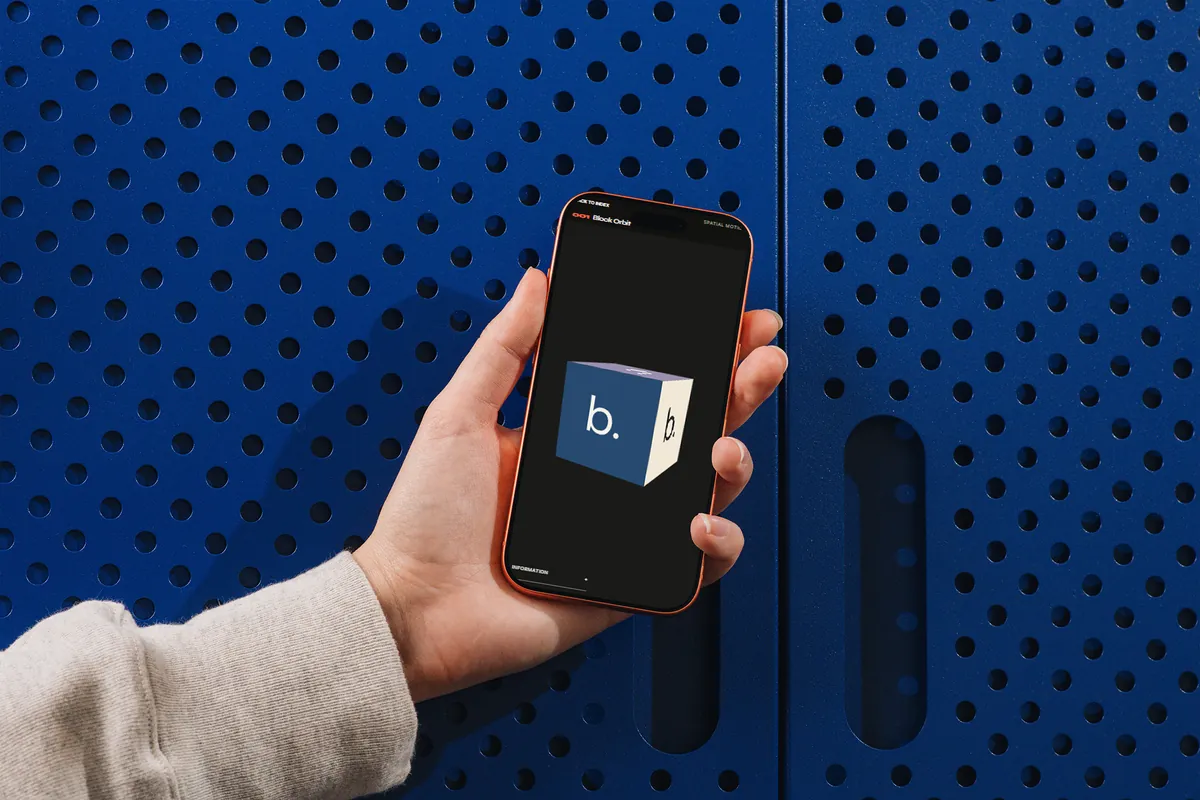
Below 900 pixels the archive becomes a single column of cards, and each artifact page fits the screen with its controls clear of the notch and the browser’s own bars.
Ambient Artwork tilts a cover toward a mouse pointer. On a phone the cover follows your finger instead: tilt, shift and press run on springs, and the drag meets more resistance near the edge. A tap opens the cover full screen; the real element is moved into a viewer and animated from where it was, so it grows out of the page rather than appearing over it.
Engineering
Light enough to run ten at once.
Ten live previews on one page add up, especially on a phone. A performance pass cut what the index downloads and how much work each preview does before it’s on screen.
Previews that need artwork wait until they’re close to the viewport, or until a couple of seconds after the page has loaded. Two preview animations that made the browser recalculate every frame were rewritten to use transforms only, so they run on the compositor. Off-screen previews skip rendering, and the analytics script waits until the page has finished loading.
Before
- The full 10 MB, 4K clip in the Scroll Cinema card
- Album covers at 2.5 MB for all eight
- 1,200-pixel covers in the colour previews
- A Split Menu preview that animated flex-grow
- An orbit animated through a custom property
- Analytics loaded right after hydration
After
- A 6-second, 960 × 540 clip of 290 KB, attached when it’s needed
- The same covers at 0.99 MB, the same size
- 640-pixel copies, about 300 KB for all eight
- Boxes placed with translate and scale
- Transform-only keyframes
- Analytics loaded after the page
Performance
Measured on a mid-range phone.
- Performance
- 100
- Accessibility
- 100
- Best practices
- 100
- SEO
- 100
- First contentful paint
- 0.9 s
- Largest contentful paint
- 1.4 s
- Total blocking time
- 10 ms
- Cumulative layout shift
- 0
PageSpeed Insights on the live index, 3 October 2026: one Lighthouse 13.5 run on an emulated Moto G Power over slow 4G.
Process
Find it, take it out, rebuild it.
Each artifact starts as something that worked inside a real project, or a question I wanted to answer. I take it out of its source, leaving the fonts, global styles and services behind, and rebuild it to the rules above before it goes into the registry.
The extractions were built with AI coding agents doing much of the typing, against the same rules each time.
-
Find
An interaction worth keeping, in a project or a prototype.
-
Extract
Leave the source’s fonts, global styles and services behind.
-
Rebuild
A full version, and a preview for its card.
-
Fit the rules
Own styles, clean-up, reduced motion and touch.
-
Publish
A registry entry, a card and its own page.
Stack
A static site with room for motion.
- Framework
- Next.js 16, App Router
- React 19
- TypeScript
- Styles
- SCSS Modules
- Motion
- GSAP, ScrollTrigger
- CSS animation
- Web Animations API
- Media
- next/image, AVIF and WebP
- Canvas, for colour sampling
- Type
- Inter Tight
- Syne
- Analytics
- Google Analytics 4
- Hosting
- Vercel
Outcome
Ten interactions that only existed inside other projects now stand on their own, each with its own page.
The archive gives me a place to keep interaction work that would otherwise be hard to show, as modules I can bring into the next project without the baggage of the last one.
It’s also the clearest picture of how I approach motion: what it’s for, what it costs on a phone, and what happens when someone would rather not see it.
Interaction design · Motion design · Frontend engineering · Component architecture · Accessibility · Performance