Acetrail
The site for an online IELTS school, redesigned and rebuilt.

Context
The old site asked before it explained.
Ace Trail Tutors prepares students for the IELTS English test, entirely online: one-on-one classes on Zoom, discussions on Telegram and mock speaking tests, over five weeks. I look after design and tech on the team, and I built the first site in Webflow.
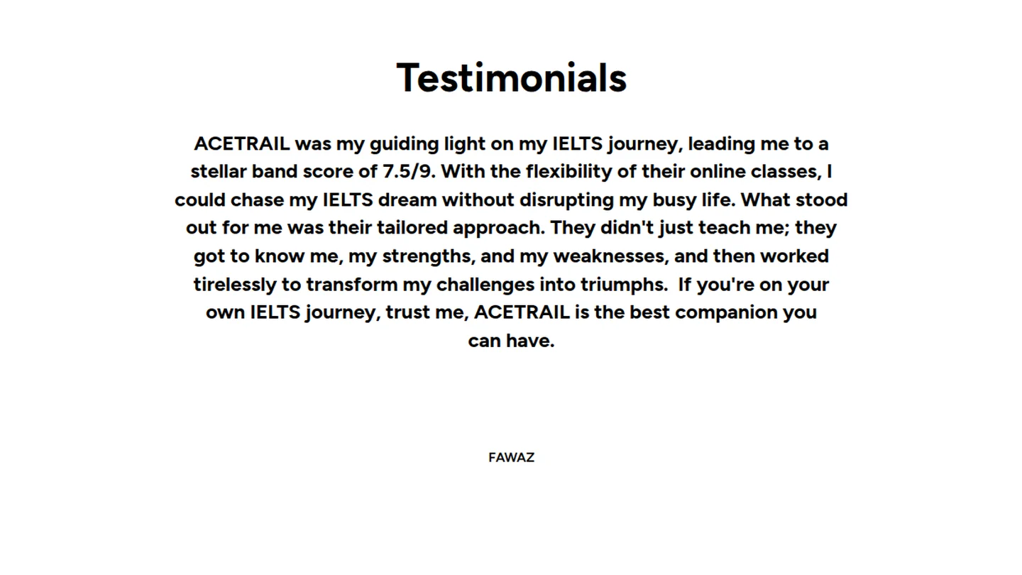
A few years on, it read like a template. The first thing it asked for was an email address. Three identical price cards gave the same space to two classes that weren’t open yet. The strongest evidence the school had, three students scoring 7.5 out of 9, sat inside a testimonial slider, one paragraph at a time.
The redesign had one job: explain the offer, put the proof up front, and make the one class that’s open easy to start.


Directions
Four directions, then one refined.
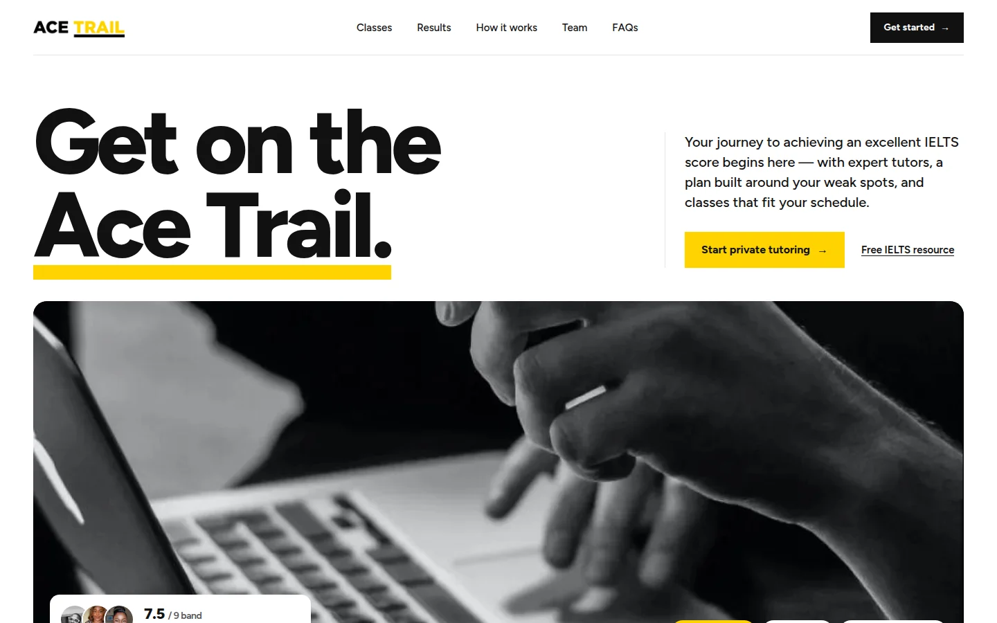
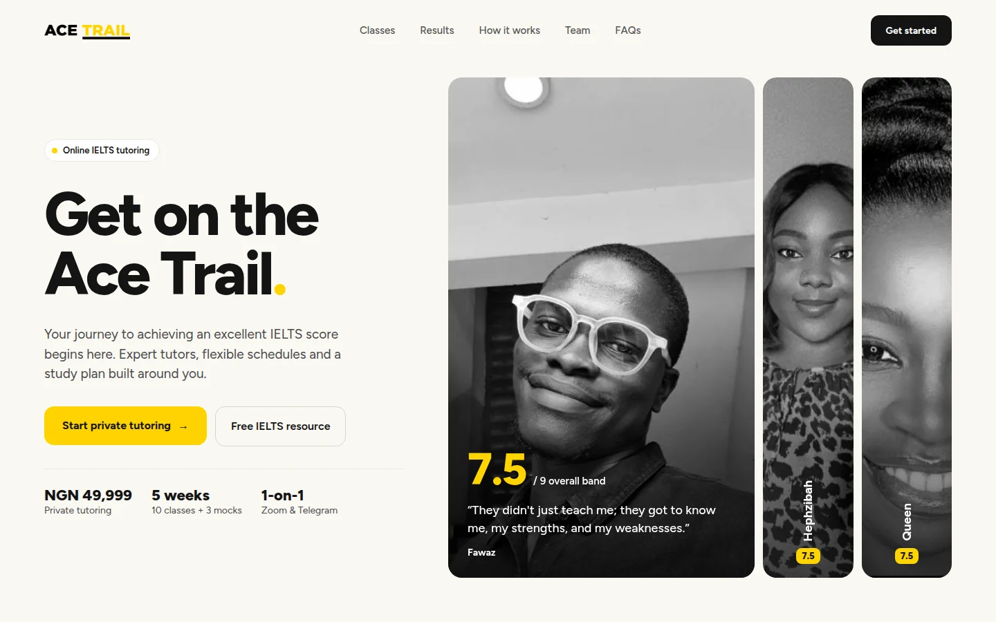
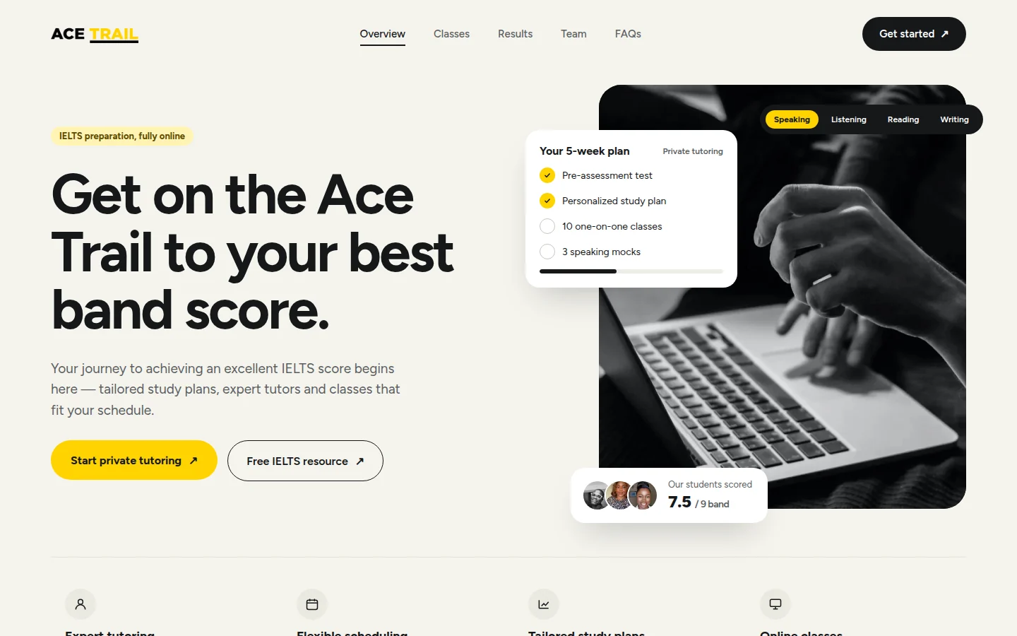
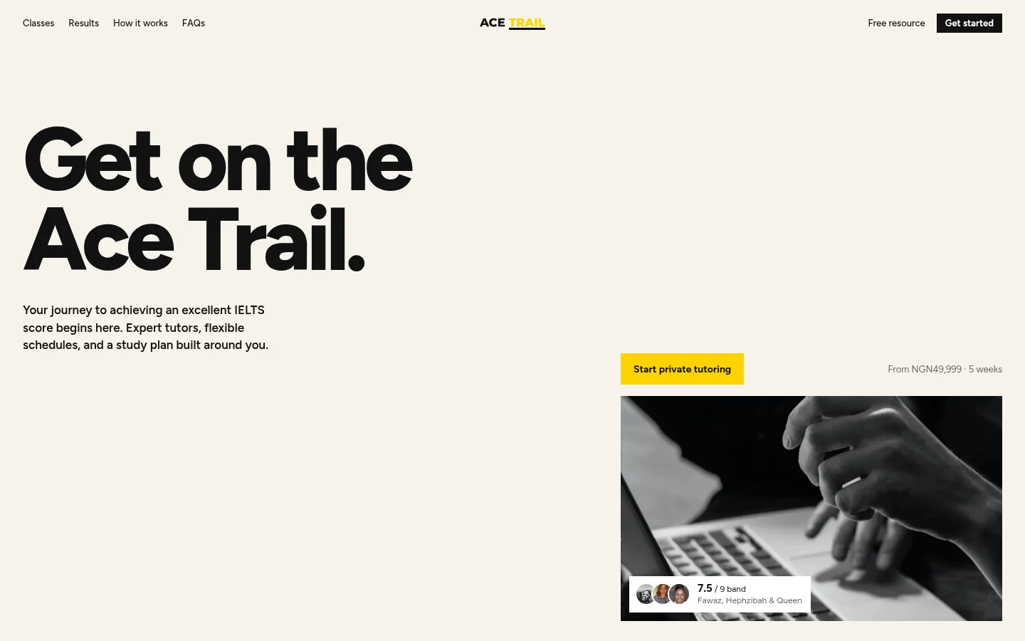
Before writing production code, I designed the homepage four ways: an editorial layout, proof cards built from student photos, a study-plan dashboard, and an editorial layout with a sticky photo driven by scroll. The fifth option refined that last one, and it’s the one that was built.
It kept what was already Ace Trail’s, the yellow and the Figtree typeface, while simplifying everything else: square-cornered buttons and photos, a short palette, and type doing the work of hierarchy.
System
-
Off-white
#F6F3EB -
Ink
#111111 -
Ace Trail yellow
#FFD300 -
Pale yellow
#FFF3C4
Get on the
Ace Trail.
Figtree, 400 to 800. Headings set at 800; body copy at 500 and 600.
The hero
One photo that opens up as you scroll.
The first screen states the promise and the price, with the proof pinned to a small photo. As you scroll, the photo grows to fill almost the whole window, the headline fades, and a caption arrives: five weeks, one tutor, a plan built around you.
It runs on transforms alone. The photo’s frame is laid out at its final size and scaled down to its starting box, and the image inside is counter-scaled so it always fills the frame without stretching. Nothing changes width, height or position mid-scroll, so the browser never has to recalculate layout. With reduced motion on, the hero simply shows one state or the other.
Classes
One open class, in focus.
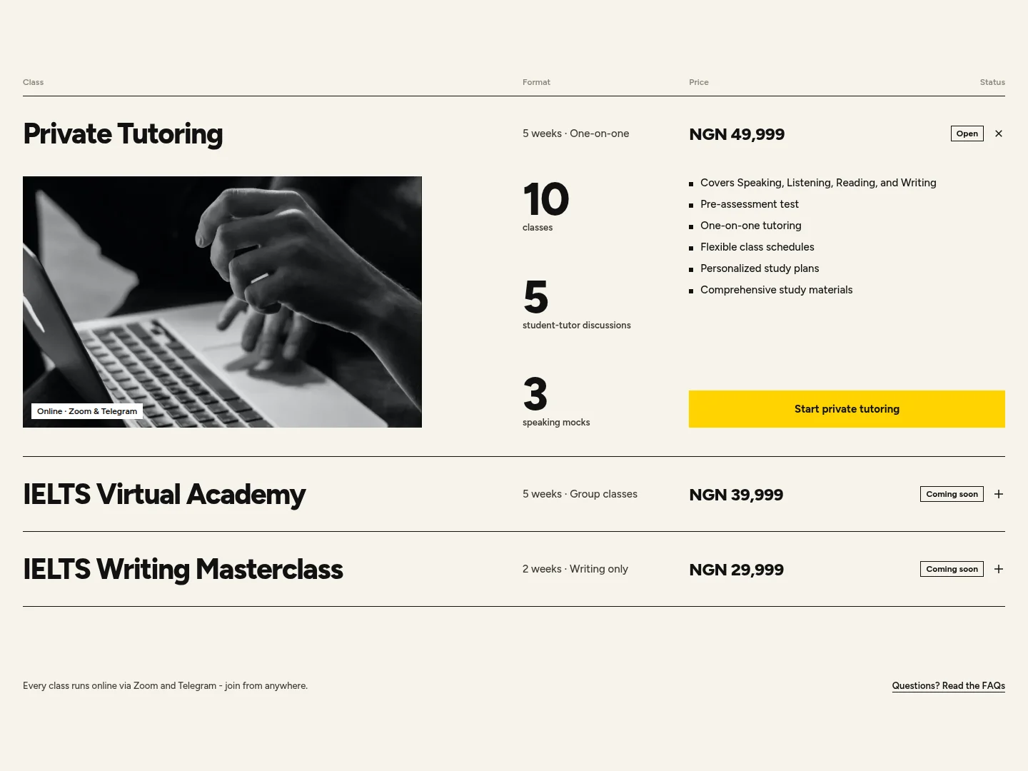
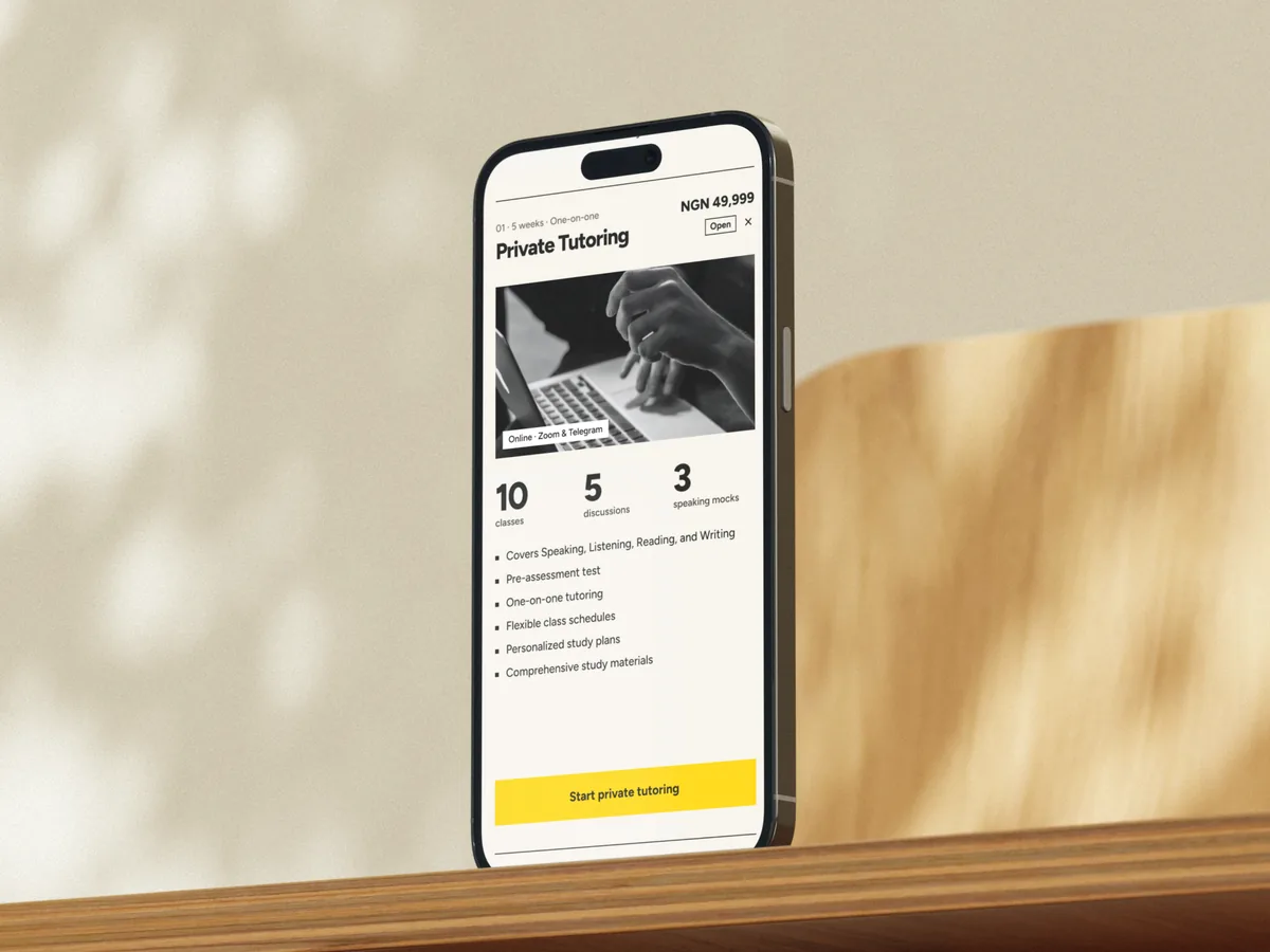
The old cards gave three classes the same space, and only the buttons at the bottom said two of them weren’t open. The new section is a table: class, format, price and status on one line each.
Private Tutoring opens by default, with what’s included and the button to start. The two classes that haven’t launched stay folded behind a Coming soon tag, with a blurred photo and no button.

Results
Let the score lead.
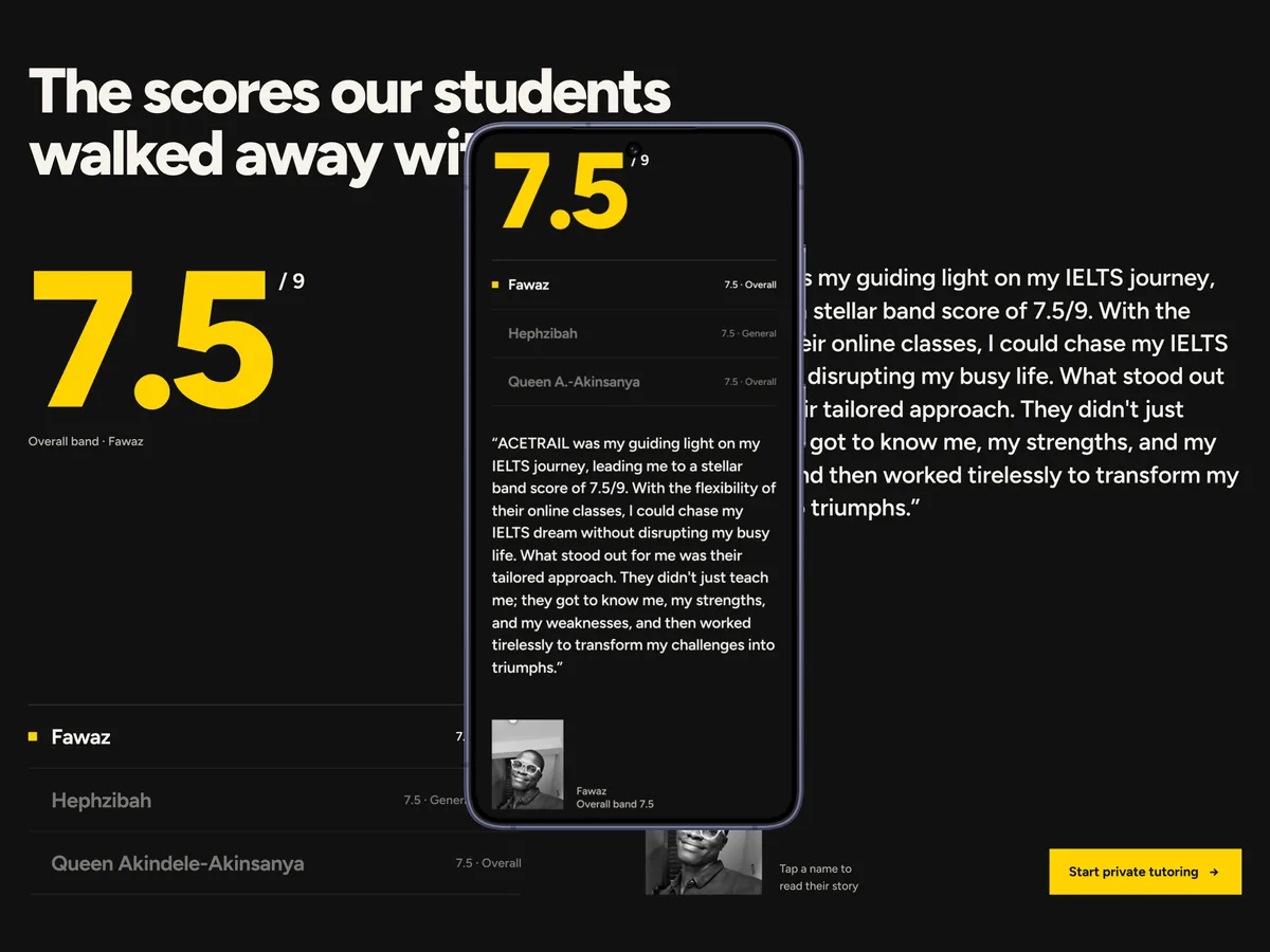
Three students, three scores. The redesign puts that number first, at display size in Ace Trail yellow on black, with the students listed underneath. Choosing a name swaps the quote, the photo and the test type.
Selection happens on click or tap. The list is built as tabs, the quote is announced to screen readers when it changes, and it slides in from the direction you moved.
How it works
From a paragraph to five steps.
The old About section was a paragraph of claims. It became the five weeks themselves: a pre-assessment test, a study plan built from its results, ten one-on-one classes, discussions and speaking mocks, then test day, each tagged with when it happens.
On desktop the step number sits in a sticky column and rolls to whichever step crosses the middle of the window. Passed steps dim, upcoming steps dim further, and clicking a step selects it too.
Engineering
Off the Webflow export.
The old site carried Webflow’s runtime: jQuery, webflow.js, a smooth-scroll library and a font loader requesting fourteen styles of Figtree. The smooth-scroll wrapper alone ruled out sticky positioning, which the new hero depends on.
The rebuild is plain HTML, CSS with custom properties, and one deferred JavaScript file. The CSS is inlined so the header and hero paint on the first frame, and no script runs until after it. Figtree is self-hosted as one variable file with metric-matched fallbacks, so text doesn’t jump when it loads. On desktop, GSAP and ScrollTrigger load only once someone starts scrolling and the page is idle; until then, and on phones, the hero scrubs on native scroll.
Everything the business relies on stayed: the Paystack payment link, the Mailchimp form, Google Analytics, and the old section links, which still land in the right place.
Before
- Webflow export
- Three stylesheets
- jQuery 3.5
- webflow.js
- luxy.js smooth scrolling
- Web Font Loader, 14 styles of Figtree
After
- Semantic HTML, no framework
- One inlined stylesheet
- One deferred JavaScript file
- GSAP and ScrollTrigger, desktop only, on first scroll
- Lenis, for desktop wheels only
- One self-hosted variable font, 20 KB
Performance
Measured on a mid-range phone.
- Performance
- 100
- Accessibility
- 100
- Best practices
- 100
- SEO
- 100
- First contentful paint
- 1.0 s
- Largest contentful paint
- 1.4 s
- Total blocking time
- 0 ms
- Cumulative layout shift
- 0
PageSpeed Insights on the live site, 2 October 2026: one Lighthouse 13.5 run on an emulated Moto G Power over slow 4G. The desktop run also scored 100 in all four categories.
Process
Specified first, built a section at a time.
Before any code, I exported the chosen design as a reference: screenshots of every section at 1440 and 390 pixels wide, inspectable HTML, and the interaction source. Then I wrote the spec: tokens, type scale, section-by-section layout, every timing and easing, and a definition of done.
The build went section by section, with AI coding agents doing much of the typing. Before the next section started, each one was compared with the reference in Playwright screenshot diffs at both widths, tried from the keyboard, and checked with reduced motion on.
-
Explore
Four homepage directions, then a refinement.
-
Decide
Option E: one photo, editorial type, Ace Trail’s yellow.
-
Specify
Tokens, layout, every timing and easing, and a definition of done.
-
Build
A foundation, then seven sections in order, one commit each.
-
Verify
Screenshot diffs at 1440 and 390, keyboard, reduced motion, 320 to 1920px wide.
Stack
A small stack for a marketing site.
- Design
- Claude Design
- Markup and styles
- HTML
- CSS custom properties
- Interaction
- Vanilla JavaScript
- GSAP, ScrollTrigger
- Lenis
- Type
- Figtree, self-hosted
- Integrations
- Paystack
- Mailchimp
- Google Analytics
- Testing
- Playwright, pixelmatch
- PageSpeed Insights
- Hosting
- Netlify
Since launch
Live, and still moving.
The redesign went live in late September 2026. Since then it has gained team cards that flip to a short bio, new portraits with matching backgrounds, class rows that open independently, a round of mobile fixes, and more work on how quickly the page starts up.
Outcome
The site now explains the offer before it asks for anything, and leads with the result students come for.
I redesigned it, specified it and rebuilt it, kept every integration the school depends on, and it now scores 100 in every Lighthouse category on mobile.
It’s also how I like to work: decide in the browser, write the decisions down precisely, and check the build against the design until they match.
Visual design · Interaction design · Frontend engineering · Performance · Accessibility · Specification · Testing