Morrow Studio
Designing both sides of a portfolio: the experience visitors see and the CMS editors use behind it.

Context
A fictional studio, built like a real one.
Morrow Studio is a fictional independent creative practice I created as a personal project. I wanted to learn Sanity properly and explore how to build a flexible content management system that could support a highly art-directed website without compromising its visual identity.
It grew into a complete studio site: an identity and an editorial design language, ten case studies with their own desktop and mobile compositions, a CMS shaped around the people who would edit it, a script that moved all the content in, and a long round of visual and interaction QA.
Design
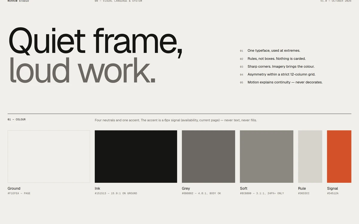
Quiet frame, loud work.
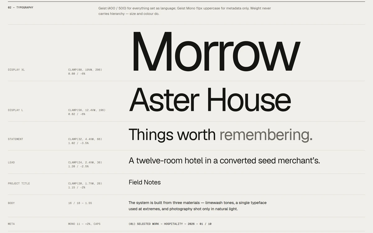
That line opens Morrow’s design system, and the rest follows from it. The frame stays quiet: warm neutrals, an orange accent kept for small signals, one typeface used at its extremes, thin rules instead of boxes, and sharp corners. The colour comes from the photography.
Layouts are asymmetric within a strict 12-column grid. Motion explains continuity and never decorates: titles rise from a mask, images unmask as they enter, the menu staggers in, all on two shared curves. I explored the direction in Claude Design, and its exported frames became the reference the build had to match.
Ten projects
Ten case studies, one renderer.
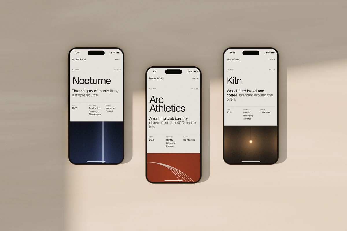
Morrow features ten projects, ranging from a hotel in Margate to a running club in Bristol. Rather than building each page separately, I created a reusable system of ten content blocks, including text, images, galleries, videos and quotes. A single renderer brings everything together, while project-specific layout rules control how each page looks and feels.
The Work archive brings all ten projects together, with category filters, list and grid views, and an interactive preview that updates as you browse. On mobile, the layout adapts to show each project's thumbnail directly in the list.
Content model
Sanity holds the content. The code holds the layout.
Every project is one document: its details, a cover and a hero image, then the blocks in order. Editors decide what a page says and in what order it says it.
How it looks stays in code. Grid spans, offsets, aspect ratios, overlaps, spacing and timing belong to the design system. Editors get a few preset choices, such as where a contained image sits, but no free widths or offsets: I didn’t want the CMS to become a page builder.
In Sanity
- Copy and captions
- Images, crops and alt text
- Section order
- Service labels
- Mobile replacements
- Project order
In code
- Grid spans and offsets
- Aspect ratios
- Overlaps
- Spacing
- Type scale
- Motion and timing
Mobile
Mobile is an edit, not a stack.
The mobile experience was designed separately, not simply adapted from desktop. Projects could have different hero images, shorter text, fewer gallery images and a different section order. Rather than maintaining two separate versions of every project, I built a system that could support both.
Each project lives in a single CMS document, making content easier to manage and update without duplicating work. Changes to shared content are reflected across both versions, while desktop and mobile can still have their own images, text, section order and visibility settings. For example, Forma uses a different content arrangement on mobile, replacing certain desktop sections with mobile-specific ones.
Forma on desktop
- Overview
- Image pair
- Structure
- Drawings
- Statement
- Full-width image, desktop only
- Gallery, desktop only
- Quote
- Credits
Forma on a phone
- Overview
- Full-width image, mobile only
- Image pair
- Statement
- Drawings
- Image pair, mobile only
- Structure
- Quote
- Credits
The CMS
The site wasn’t the only interface.
A well-structured CMS isn't necessarily easy to use. The default setup exposed technical field names, confusing options and long forms that could make managing content difficult for someone unfamiliar with the code.
I customized Sanity Studio to make content management simpler and more intuitive. Editors can log in and update the website without touching the code. The interface focuses on what they need: the Home page, About page and ten projects, organized with clear labels, thumbnails and project details.

Editing
Organised like the site, in the editors’ words.
Each document is organized into clear sections that match the website, making it easier for editors to find and update content. Mobile settings are kept separate, allowing editors to customize the mobile experience only where needed. Otherwise, the main content is used automatically.
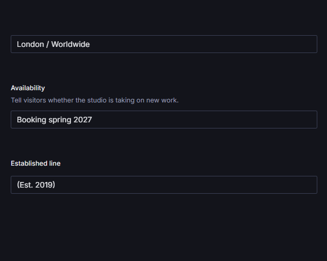
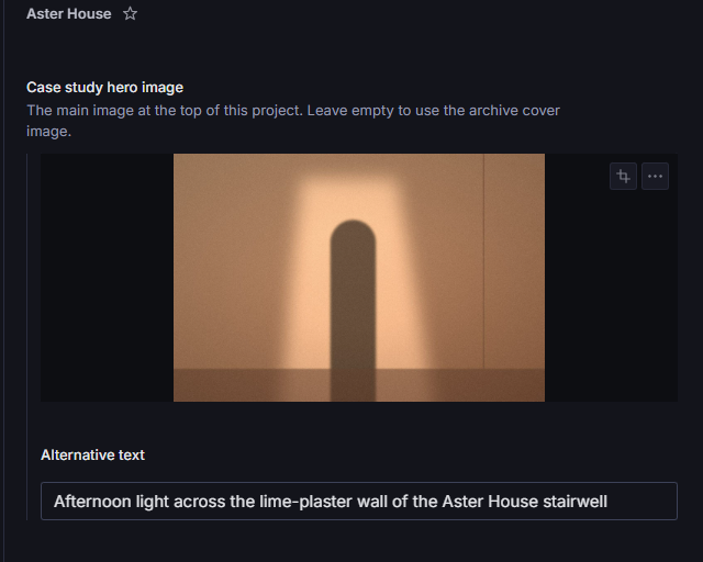
Fields have clear names and helpful descriptions so editors understand what they're changing. I also added validation to catch mistakes before publishing. Minor issues, like unfinished placeholder text, trigger warnings, while important errors, such as missing image descriptions or duplicate project ordering, must be fixed before publishing.


In the schema
- orderRank
- disciplines
- heroImage
- mobileOrder
- visibility: all
- 8a00e8e08307a2b9
- sourceType: unresolved
In the Studio
- Project order
- Archive filters
- Case study hero image
- Mobile section order
- Desktop + mobile
- Fig. 01 The signwritten lintel…
- Poster only — video source pending
Preview
Edit a draft, see it in the site, then publish.
Nothing an editor types goes live by accident. Changes save as drafts, and Sanity’s Presentation tool shows the draft inside the real website, beside the fields, with the page’s text and images linked back to the fields they come from.
Every document also says where it’s used: a project lists its own page and the Work archive, and Presentation opens either one beside its fields. I wrote the editors a short guide to the rest, from logging in to undoing a mistake.
- Edit
- In the hosted Studio, in the group that matches the part of the page.
- Draft
- Every change saves as a draft. The public site stays on the published version.
- Preview
- Presentation shows the draft in the real site, on desktop and on mobile.
- Publish
- When it looks right, Publish puts it live.
Migration
Ten projects, moved in by script.
Typing ten projects into the Studio by hand would have been slow and easy to get wrong. A migration script read the design export, mapped it to the schema, uploaded the images and wrote everything as drafts, which were checked against the source before anything was published.
It can run again without duplicating anything. It patches documents that already exist, creates the ones that don’t, keeps their original IDs so the home page’s links to them hold, and reuses any image Sanity already has.
- Projects published
- 10
- Images mapped
- 65
- Uploaded
- 56
- Reused
- 9
From the migration report, 5 October 2026. Five projects were created and five that already existed were patched.
QA
The last stage removed differences.
Once everything worked, the job was matching. Playwright captured all thirteen routes at six widths, from 1440 down to 320, and the main pages were compared side by side with their reference frames, adjusted and captured again.
A separate pass checked behaviour rather than pixels: navigation, the menu, focus matching hover, the filters, list and grid, the galleries, next-project links and reduced motion. The final run passed every check.
Process
Designed first, then built to match.
Morrow was designed first and built against that design, one layer at a time: the pages, then the content model behind them, then the content itself, then the Studio and the details.
I led the design, defined the content model, and oversaw the development, using AI coding agents to support the implementation.
-
Design
The system, then every page, on desktop and on mobile.
-
Build
Next.js pages and one renderer for the ten blocks.
-
Content model
Schemas for the projects, Home and About, with the mobile overrides.
-
Migration
The export moved in by script, checked, then published.
-
Refinement
The Studio for editors, then visual and interaction QA, performance and accessibility.
Stack
Next.js in front, Sanity behind.
- Front end
- Next.js App Router
- React
- TypeScript
- SCSS
- CMS
- Sanity Studio
- GROQ
- Portable Text
- Preview
- Presentation
- Visual Editing
- Draft Mode
- Images
- Sanity image pipeline
- Hotspots and crops
- Testing
- Playwright
- Hosting
- Vercel
- Sanity Studio hosting
Outcome
What began as a way to learn Sanity became a site with two audiences.
Visitors get an editorial portfolio with ten distinct case studies. Editors get a Studio that speaks their language, shows every change in the real site before it goes live, and keeps the layout out of harm’s way.
The lesson I’m keeping: the structure of a CMS is design work too. Not every visual decision belongs in it, and on a phone, a page can be an edit rather than a smaller copy.
Visual design · Interaction design · Frontend engineering · CMS architecture · Editor experience · Content migration · QA